
Energy storage revolves around numerous variables that can all have an impact on system performance and profitability, including:
- Solar production levels
- Electricity demand
- Tariffs and rates
- Battery charge and discharge cycles
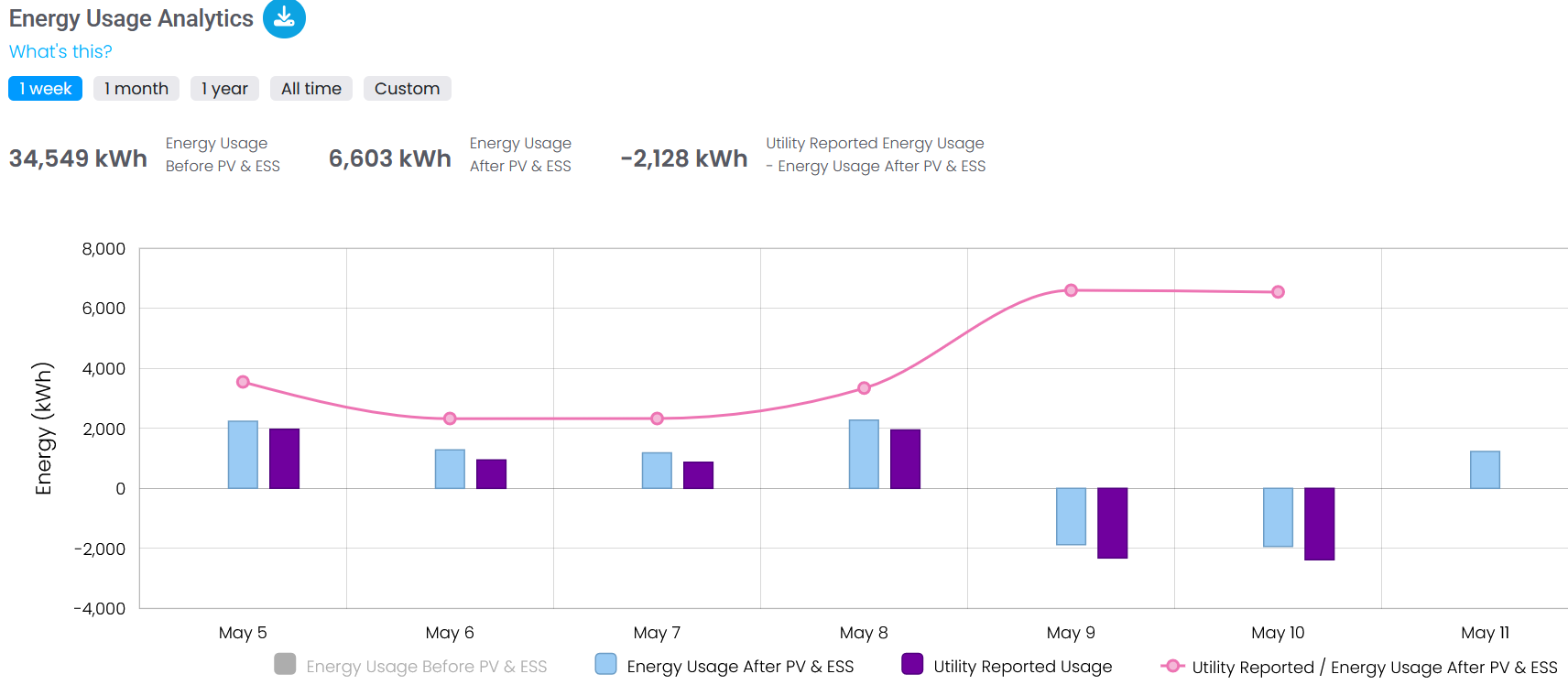
Optimizing energy storage relies on time-sensitive (and ideally automated) adjustments, driven by real-time data that eliminates costly mistakes or static rules that don’t account for changing tariffs or peak rates. Whether monitoring live energy storage systems or working on simulations to support proposals, visualization tools create graphics that are easy to digest and track data over time, such as charts showing solar power generated vs. used or graphs displaying revenue projections.
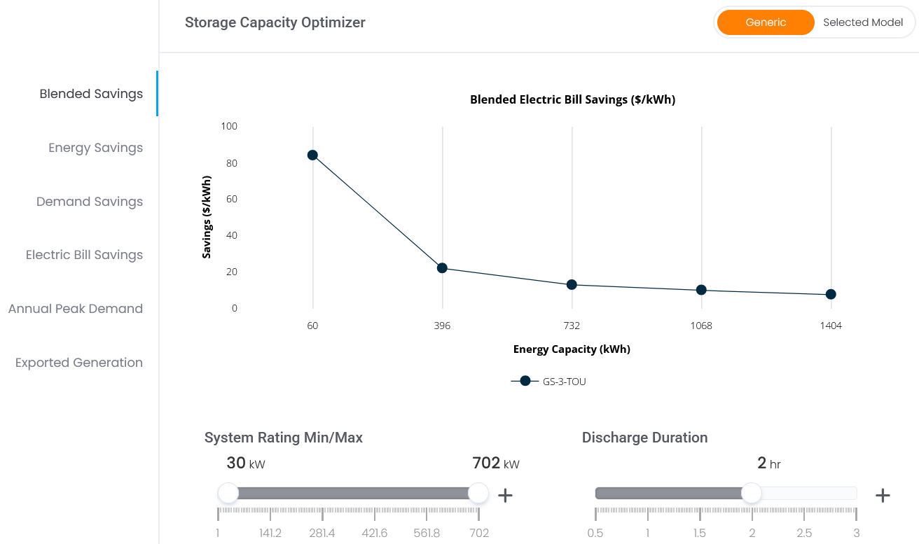
This can be particularly beneficial during project planning. Developers often need to simulate how a proposed system will perform under varying conditions, such as changing tariffs or seasonal solar production rates, to understand projected performance before moving ahead, or to optimize system sizing recommendations.
There is no doubt that data plays a vital role in energy storage management, but how well that data is managed, collated, and displayed has a direct impact on its usefulness, because messy datasets, limited detail within simulations, or a lack of financial modeling can lead to inefficiencies.
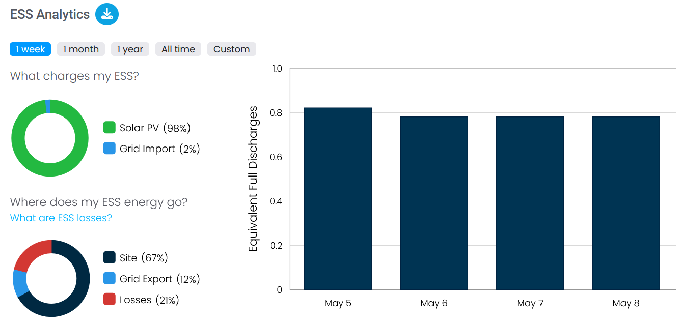
Visualized data, such as a chart showing battery charging performance from solar during the day and discharging in the evening at peak prices, ensures that organizations communicating outputs or results with investors or other non-technicians can provide reports that anyone can understand. It also supports faster decision-making when manual interventions are required, flag inefficiencies that might otherwise go unnoticed, and ensure that battery usage patterns are continually monitored.
ETB Developer is designed to produce accessible, accurate charts and graphs, with an interactive Demand Profile Visualization feature that enables users to track all relevant data points, such as:
- The facility’s energy demand
- Solar power generation
- Battery charge and discharge activities
- Net grid usage
- Battery charge levels
To learn more about how our ETB Developer models and visualizes energy storage projects, visit our website.